|
So on the right is the picture of the ten objects I found around my house. There is a remote, 4 pound weight, some sort of antique jar, a lime, pencil, lighter, scrunchie, pin tack, light bulb, and a makeup brush. On the left is a picture of the three objects I chose which were the lime to be a back of a turtle, a light bulb to be the balloon on a hot air balloon, and the makeup brush as a skirt on the girl. I came up with these ideas while looking at objects around my house and wondering how their shapes could be used to be a part of something else. So I did not really like my third sketch but I liked the other two and chose to do both of them. While researching for this project, most of the backgrounds were pretty blank so I decided to give in a little pop by using water colors. I think it adds more detail to what exactly is happening and kind of integrate the objects a little bit more if that makes sense.
0 Comments
So for this project I chose the statue Discobolus. It is a Greek statue of a man throwing a disc and was made in the classical period. The reason why I chose this is because I love art and architecture from the classical period and hope to one day visit Greece to view the buildings that have been left behind. I chose this sculpture specifically cause I knew exactly how I could recreate it. I made my sister dress in all white, put her hair up, and hold one of our kitchen plates like so. I edited the color out of the photo so it was even more similar to the statues. We had a few laughs while trying to get her into position and this was overall a fun project.
So for the overall theme of the photos I was inspired by black and white TV shows. Although TV's were not in existence during the Spanish Flu, the added effect of black and white alludes to the past. Black and white horror movies also have more of an eerie effect to them which is what I wanted my pictures to reflect. It is an odd time unlike any other that we have experienced and eerie is a word that perfectly describes how things are feeling right now.
The first picture I shot was in our bathroom closet and focuses on the paper goods. It is so weird to think that toilet paper is like gold right now. This everyday product is now really hard to find as shelves have been wiped of them. I was unable to get a picture of the empty toilet paper shelves but there was an awful feeling I had when I starred down the paper aisle and the was nothing there. I edited this photo so that the paper goods would stand out against the dark background to show the importance of this everyday product. The second picture I chose to take of my gloves and mask for going out. I have barely left the house but any time I have it has been odd to see everyone wearing masks and gloves. Some stores are even limiting how many people can go in and they are controlling how you can enter the store. Gloves and masks are also important in the medical field as those workers are at risk everyday and the only thing separating them from COVID-19 is a mask and a pair of gloves. These are also becoming more important than usual which is why they are the focus. For the final picture I got my sister to peak out her blinds while I took the photo. Many people are unable to leave the house right now as we are under a stay at home order. It's very odd to be at home for so long and barely be allowed out. Some people are even scared to leave their homes as they are at risk of catching COVID-19. Many people are longing to leave their houses which can be seen in this as the tree line is reflected in the window. This is a very odd time that feels so surreal. Prior to all of this, at the beginning of March, people were joking about it on social media and then before we knew it we were out for two weeks. I thought we would go back after two weeks but then two weeks turned into staying at home until May 15th and now we won't go back until next year. It all happened so fast that it is kind of hard to grasp, it is even harder to grasp that it is not just us going through this but it is the whole world. I chose these photos because I think they best reflect what is happening. 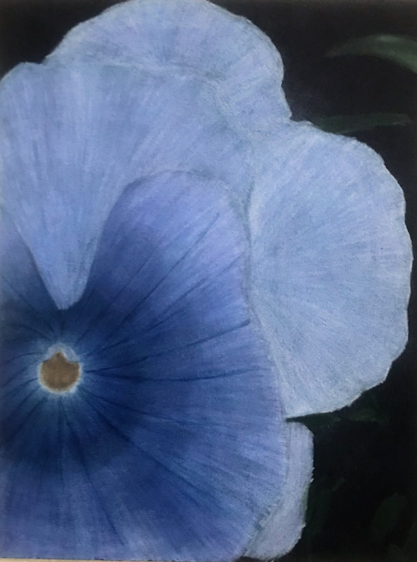 Self Evaluation: 1. For craftsmanship, I put a lot of time into my work. I'd say it took me more than ten hours, I started losing count of how long it took after a while. I worked really hard on this but still made some mistakes. For example, one of the things I did wrong was I layered the colors a little too heavy which caused a problem at the end when I still needed to add more white to make it look more like the photo. Another problem I ran into was that the lead chips ended up on the black background and colored it. It is not the cleanest piece but I know that I put a lot of thought and time into how I would go about this. 2. There are a lot of values to be found in this drawing. I'll admit that there could be more for extra detail. I used darker blues towards to center to show it going in towards the middle and used some white around the middle to kind of give the illusion of depth. There are also dark lines extending from the middle to create creases in the flower. I also used that in the other petals to establish the direction it is going in and to also show the creases. 3. This represented Georgia O'Keeffe's style by using close up nature. In O'Keeffe's work, she used nature that looked abstract because it was so close. I did the same thing with cropping and zooming in a lot on my photos. Even though you can still tell it is a flower, it is abstract because it is seen so much closer than usual. 4. For this project I used a lot of white to make the light colors. For shading I used darker blues and purples instead of black. The flower almost looks periwinkle which is why I mainly just used darker blues and purples that were close to magenta. For the center I used yellows towards the bottom of the circle and oranges towards the back to show depth. For the background, it was mainly black so I left the paper blank and then colored in the green parts that were visible from the leafs in the back. 5. The main contrast in this drawing is the yellow-orange center compared to the blue. Since these colors are on opposite sides of the color wheel it made a pop in the drawing. Other than that there was a contrast between the black background and the colored pieces, more specifically the light outer petals. There is also a difference between the darker middle compared to the lighter outer petals. 6. I used texture when I was coloring the petals by considering the direction. It made it appear as though there were creases just like the ones that you can find on the flowers. Highlights can be found around the center of the flower and by using lighter colors around the green leafs in the backgrounds. Shadows are created towards the center as the petal gets darker. I also made the bottoms of the petals darker so that they appeared to be behind the other petals. 7.A difficulty I had with this was layering the colors the right way. Sometimes when I started layering them i had a plan in mind about how to make certain colors but it didn't always come out right. I also tried layering too much to the point where the wax had sealed before I was able to finish the colors. I tried to work around that but I wasn't always successful. It has been a couple of weeks since I last worked with colored pencils so I think it would benefit me in the future to do a bit more practicing and to be more mindful of my layering. UP-Close Nature Drawing progressNext I started drawing, here are some in progress photos of that. The next thing I did was choose the two photos of flowers I liked the most and cropped them to 3x4 dimensions. I also cropped out the rest of the background and zoomed in until the flowers looked abstract. Between these composition pictures, I chose the first blue flower to do my project with. The first thing I did for this project was go outside and take photos of the flowers in our landscape. Most of our flowers were in bloom since it is spring which made it easy to find a variety of photos. This is similar to what we normally do for brainstorming before starting our projects.
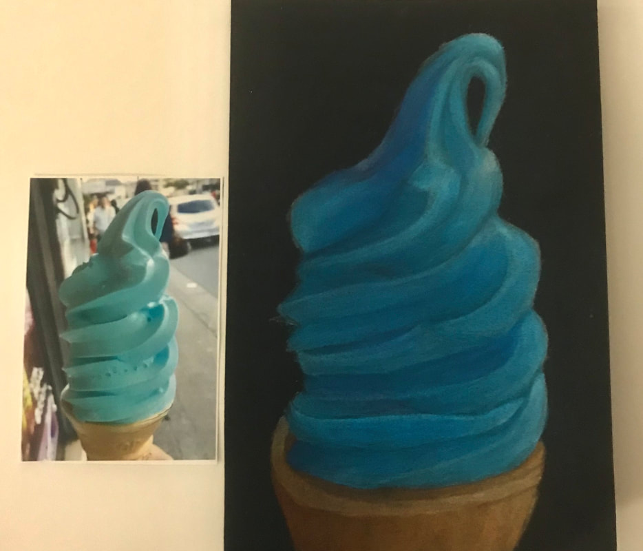 For this mini project we were tasked with drawing either an ice cream cone or a cupcake. For mine I chose an ice cream cone and used value to create depth within my drawing. After layering the colors multiple times and using a colorless blender this is the result.
 Self Evaluation:
1. I mainly used stippling throughout the majority of the project. I found it to be more detailed and effect than the other methods which made it a personal preference. It also just so happened to make sense with the textures I was using like the rocks on the wall and on the floor. However, I did use a different method for the spinning wheel itself. It wasn't hatching but it was very similar where I used the pattern for the wood but closer together in the back to make it appear darker. 2. I used perspective throughout the picture with one-point perspective. My point for the whole picture is the top left corner on what I drew to be the wall. 3. Texture was important in making it look more realistic. It also helped make the scene look more realistic like using the stone for the walls as opposed to being in fur. 4. Value is important in this project for defining perspective. The values used helps create depth which is what makes things really look like the are going off into the distance. 5. I did the best to my ability for the majority of the project. I will admit that towards the end I finished a little more hastily than how I had originally started. This affected the final product by including little errors. 6. I would spend more time on it overall. I tried to work on this as much as I could but the stippling took a lot longer than I had anticipated which made me drag out finishing the project until today in class. I would also try to consistently use the same pen for the same thing like the stippling. The stippling on the ground on the left and right of the spinning wheel look different because I accidentally used the wrong pen for the stippling on the right and didn't notice it until it was too late. 7. I did Sleeping Beauty and chose the scene where she is pricking her finger. In the movies. this seen is usually in a dark windowless room in the castle. I made mine brighter and added windows in mine which made it somewhat different. I also did it like as if you were looking through Aurora's eyes as she is about to prick her finger which is different from how it is normally portrayed. 8. When applying these techniques it is important to understand how to use them so you create the right image. I tried to stay away from techniques I was not great at in my project to avoid from making mistakes. For example, three point perspective from a birds eye view is not my strong suit so I did my project in one point perspective. 9. I think that I have learned some valuable things for my next projects. In my next projects I will learn how to manage my time better to avoid running into what happened this time. The first photo is my final sketch in my notebook. the second is the reference photos I used for my composition sketches, the third photo is the composition sketches for my two ideas, and the last photo is my brainstorm for ideas. These are my progress sketches and the first one starts at the far right and goes to the left.
In these drawings we learned how to use patterns to give a 2D drawing depth and volume. The first drawing is a value chart done with the different patterns, we used this for practicing spacing of the patterns to make things lighter or darker. In the second photo, we learned how to use the patterns around certain objects to give the illusion of depth while giving it texture. In the final photo we copied the shapes from the piece of paper we were given and had to shade the shapes using stippling.
In these drawings we learned how to control the pencil to shade like how is done above. The first drawing features a value chart and some shapes for learning the technique for shading the shapes to make them appear to have volume. In the second photo we were supposed to draw and shade the simple shapes on our table. In the final photo we were to draw and shade the objects on our table using the knowledge we gained from the two drawings before.
|


